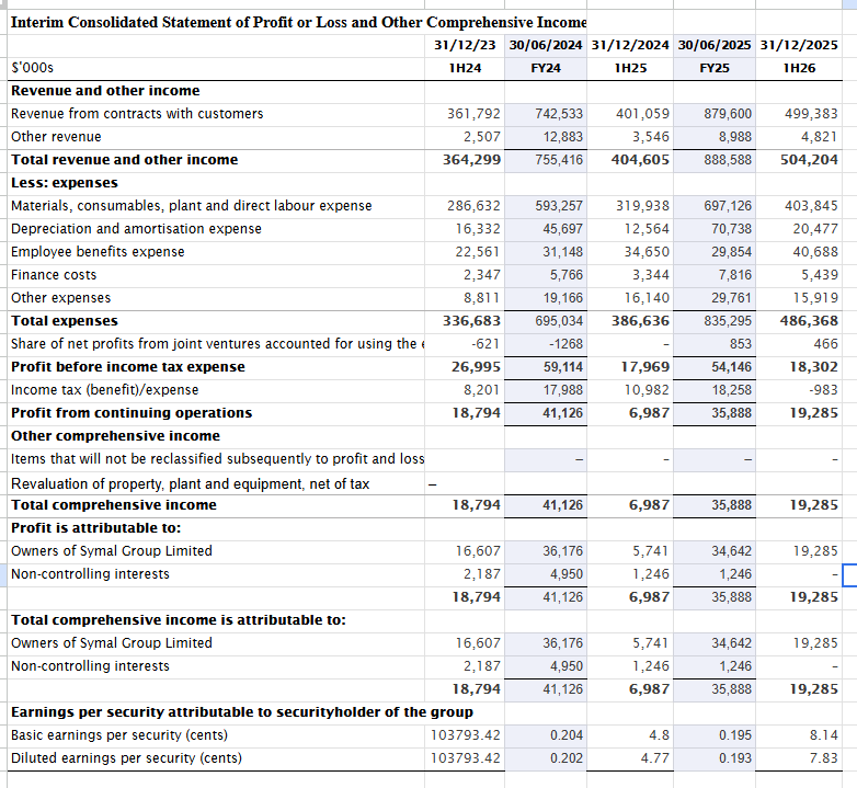
Symal’s full year 2026 financial results will be released on 24 August 2026, so we better get a move on.
When you begin an analysis, it often feels like a plate spinning exercise; building the model, while collecting the data, while making notes for your thesis. Hitting a roadblock in one task requires a pivot to another. But let’s establish some structure.
Model Framework
We know a model will be needed. My preference is to house the Profit & Loss Statement (P&L), Balance Sheet (BS) and Cashflow Statement (CFS) in one tab. It is easier to scroll or split the screen and audit the formulas.
At a minimum, the model will have the following tabs:
Summary: A high-level overview of the statements, valuation metrics, growth rates, and margins. Note: This will be the last thing we complete
Competitors: For conducting our peer analysis. I often include a sell side analysis here as well.
Valuation: Our classic Discounted Cashflow (DCF) alongside a trading multiples valuation.
Financials: The aforementioned 3-statements in one sheet
Divisions: To assess and forecast the drivers of revenue for each business unit. Some units are a higher proportion of revenue and grow at different rates.
Should look something like this (this is using Google Sheets by the way).
Tip: If using Google Sheets, ensure the settings for dates and times are configured for your preferred country and currency. It defaults to the US date format Month-Day-Year (Yuck!)

Formatting and Sheets
It is good practice to keep the first couple of rows and columns of each tab free for any headings, formulas, notes, or references. In the Financials tab, I prefer to reserve one of these free columns for notes (on the left-hand side). This ensures that when you freeze panes, scrolling horizontally maintains the qualitative notations for each line item.
Our tab headers are coloured blue, with white font. Each header will have the tab name, company name, and our unit denomination (millions in this case).
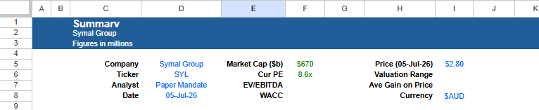
Drag the blue heading across several columns, you never know how many you will need initially. Once you are satisfied with the length, place a series of asterisks in each cell of the final column. Creating a boundary. It serves as a visual stop and an anchor when using the keyboard to flick across the sheet (Ctrl + right arrow).
Summary Tab Setup
On the Summary tab, we have populated our initial placeholders and basic asset information
You could have anything you want here but brevity is your friend. We know we will calculate a valuation and an implied gain in the future. For now, useful background information will be the market cap and a couple ratios (EV/EBITDA, P/E, WACC).
Tip: Use Named Ranges for variables that will be used often. I have a named range for company name (“Cname”), share price (“CPrice”), and ticker (“CCode”).
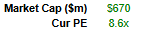
Try to make the model dynamic where you can. Pull Symal’s market cap and trailing P/E directly from Google Finance using these formulas.
=GOOGLEFINANCE(”ASX:”&$D$6,”marketcap”)/1000000
=GOOGLEFINANCE(”ASX:”&$D$6,”pe”)
Colour Format
When modelling, consistency in visuals is going to save you and anyone else auditing your work. My view is twofold:
Make the model logical (aka idiot proof)
If it doesn’t look clean and appealing, no one will want to read it.
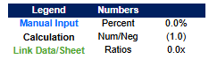
Choose a readable colour palette and have a consistent number format. Best practice is
Manual figures in blue,
Calculations in black,
Links or data or other tabs in green (You may have already noticed the market cap and P/E were in green)
Dates and Periods
We now anchor our timeline. Symal’s oldest available financials are from December 2023. So, we will select the date of the prior financial end June 2023 (which we assigned a range name “StartDate”).

Our method of data collection will be directly from the company, hence “Direct”.
As a side note: If you were analyzing a US listing, you would source financials from EDGAR to search SEC filings. There is usually an excel file or two. Alternatively, many US companies will provide their financials in csv form.
Now we setup our dates and periods for our financials.
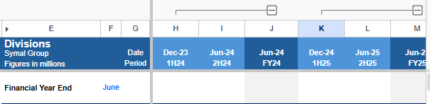
Pay attention to your period references when handling December. These represent half years. For example, the period ending December 2023 must be labeled 1H24 (for FY24), not FY23.
Here are the formulas used.

For the forecasted periods, the formulas are the same, but we are using oranges (instead of blues). Orange and blue are good contrasting colours, easy to read, and work well for people with colour blindness (red/green mostly).
For our future forecasted periods, the underlying formulas are the same, but we change our header colour to orange instead of blue. Orange and blue are good contrasting colours and look clean on a screen. Plus, it works well for people with colourblindness, particularly red/green (deuteranopia).
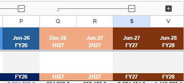
I have added a row of time periods directly beneath the headers that references the top row. This gives us a standardized period row we can quickly copy and paste when we build out sub-schedules down the line
Also, group the columns to nest your halves with the financial year they relate to. Models can grow very quickly. This is handy to condense the view.
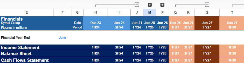
With our architecture locked in, we can duplicate the setup across to our Financials tab. We haven’t begun entering raw data just yet, but the canvas is ready.
Sourcing the Data
As mentioned previously, if this was a US company, we could search EDGAR. But we have to head straight to the source: Symal or the ASX portal.
When hunting down historical financials, the smartest strategy is to work backward, starting with the most recent reports first. Because financial reports display the current period alongside the prior period, hitting the newest data first effectively cuts the data gathering workload in half.
For our Symal baseline, opening up the 1H26 half year and the FY25 annual instantly unlocks multiple periods of data in just two downloads.
Working backward also helps if prior periods have been restated (which were the case). It is incredibly common for a company to tweak or reclassify line items from a year ago. Going newest to oldest, saves time and avoids outdated numbers.
Unfortunately, the reports are in PDF format. Use Adobe Acrobat to convert the financial into Excel spreadsheets. They won’t be clean though. Once in Excel, we can line them up correctly and make it cleaner. This is just raw data by the way, so don’t spend hours on it.
With the historic periods downloaded and aligned, and model structure in place are ready to build out our history.